
Top App Development Terms Designers Must Know
Key terms to understand, to ease your UX transition.


"I'm not quite following what you're saying by..."
Ever found yourself uttering those words during a design discussion? Well, you're not alone, and you've come to the right space.
Don't fret over your initial vocabulary limitations; consider it a starting point for growth. User experience hinges on grasping the right psychological principles and interactive components for each step of the journey. To reach that level, it's crucial to get comfortable with fundamental terms. These will empower you to communicate effectively and seamlessly integrate into the tech and design field.
Onboarding
Mobile and web onboarding might have distinct appearances, but their core purpose remains the same: ensuring users have a smooth and intuitive initial experience on the app/website.
In my perspective as a dedicated app user, the companies excelling with their onboarding accelerate the expectancy-value principle, boosting user satisfaction. Additionally, the two crucial principles for an enriching overall experience are:
Goal Gradient Effect: Motivating users through a sense of progress.
Speak-easy Effect: Using simple language.
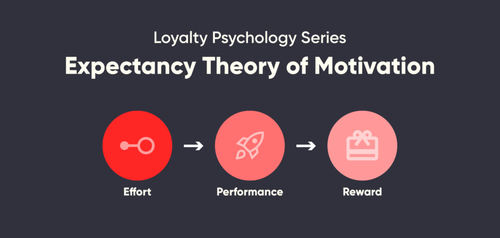
Excellent onboarding, exemplified by Duolingo, Uber, Airbnb, and others, achieves this by offering clear navigation and copy that addresses users' pain points immediately, transforming occasional users into habitual app users.
Dialogs & Modals
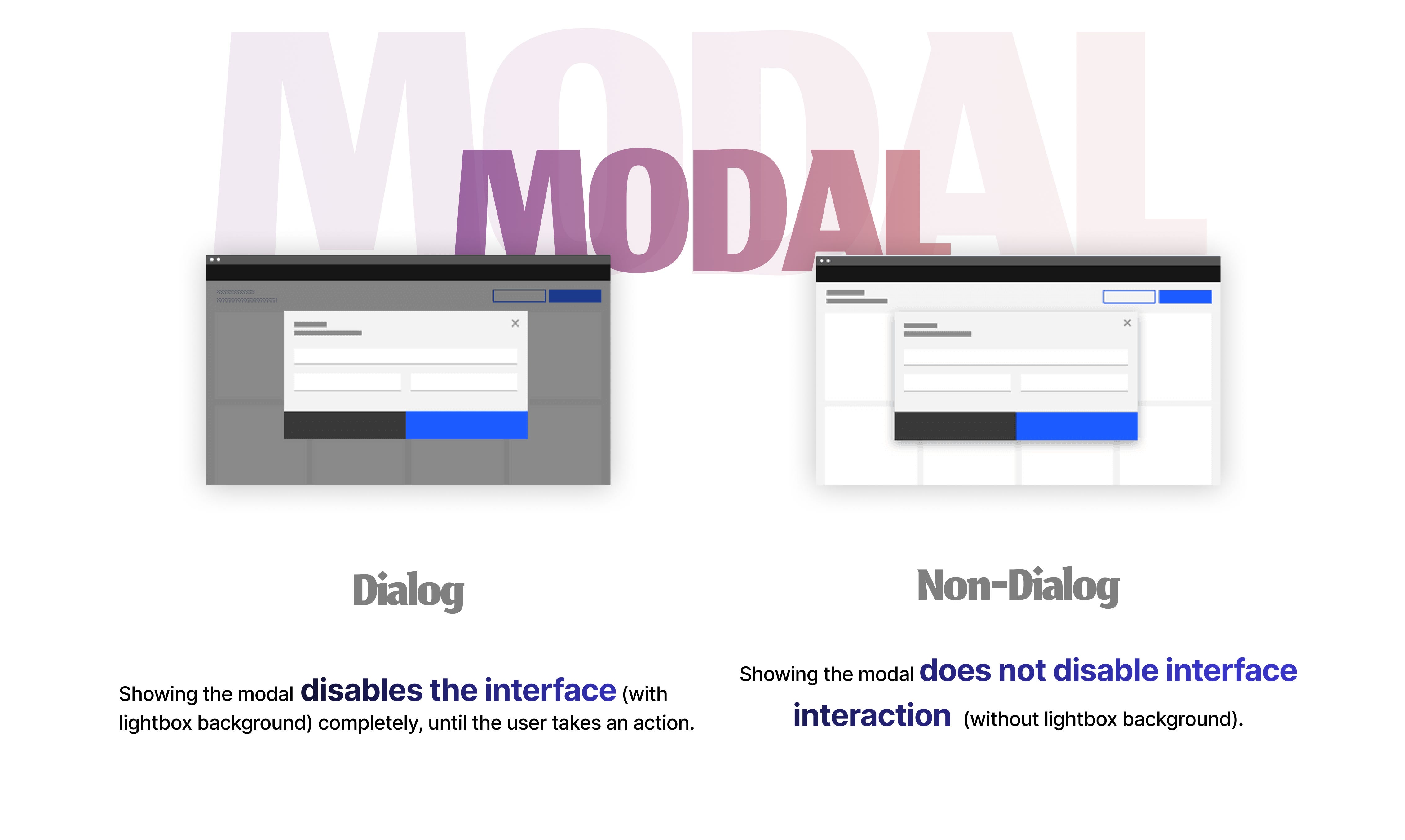
A dialog is a special type of window that appears in front of the app's content to provide important information or ask for a decision. Dialogs that disable all app functionality until they're confirmed, dismissed, or a necessary action is taken are known as modal dialogs. In contrast, non-modal dialogs allow the interface or app behind the pop-up to remain functional.
Menus
Ah, good old menus! And no, I'm not referring to the delicious food variety – though I wish I were! In the tech world, menus are lists or groups of actions that are organized under another action or tab.
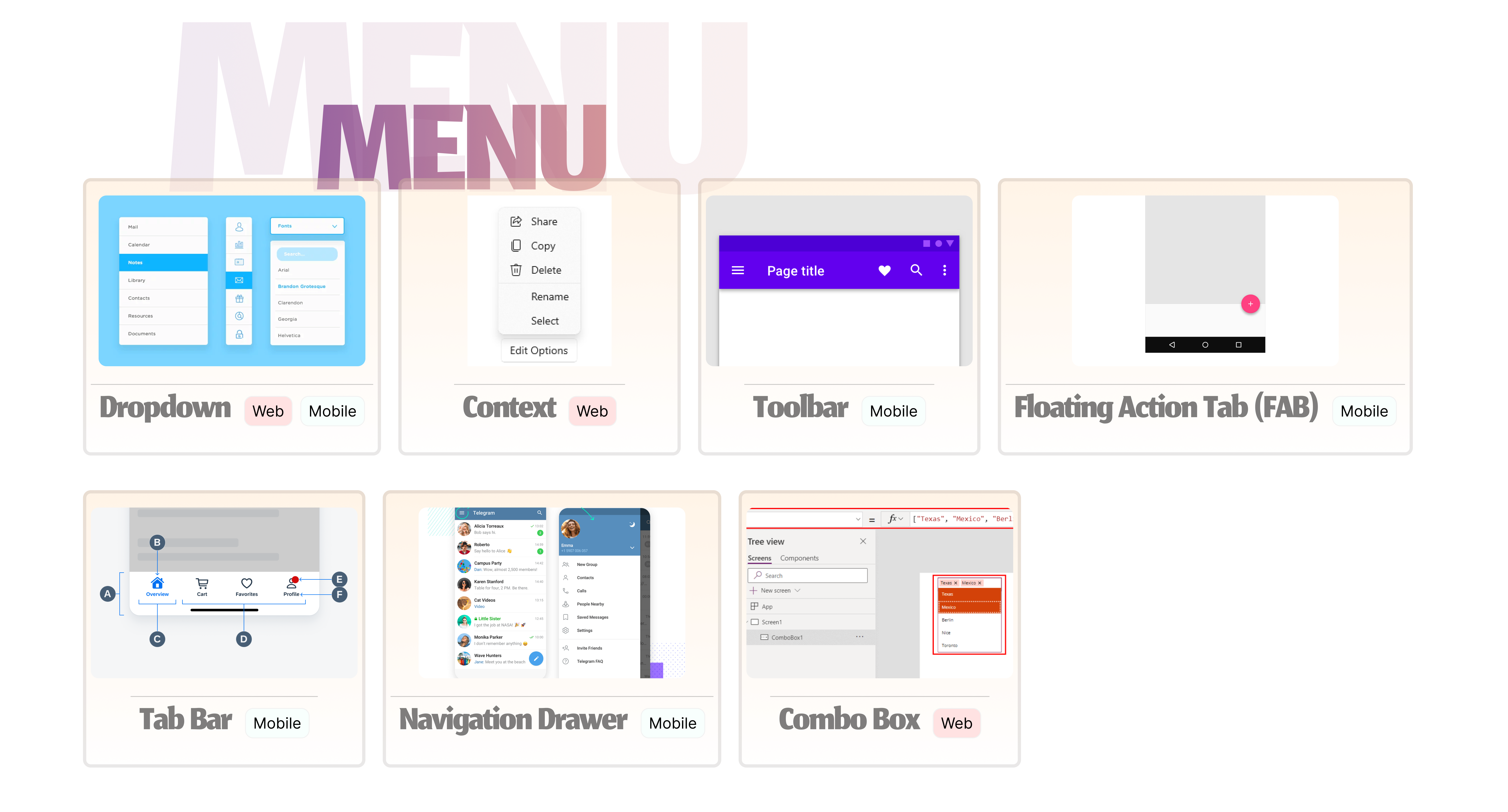
Dropdown Menu: A list of options that appears when you click on a menu title.
Context (Right-Click) Menu: It appears when you right-click on an object (e.g., a file, a word, or an item) and provides relevant actions for that specific context.
Toolbar Menu: Icons or buttons in a horizontal or vertical bar, often located at the top of the application window, providing quick access to frequently used functions.
Floating Action Button (FAB): A circular button that hovers above the interface; typically used to represent a primary or frequently used action.
Tab Bar: Found at the bottom of the screen; used for switching between different sections of the app
Navigation Drawer: Used in mobile to provide access to various sections or settings. Swiping from the left or tapping a menu icon reveals the drawer with navigation links.
Combo Box: A combination of a text field and a dropdown list.
So there you go - a quick intro to the language that lets you dive into the exciting worlds of tech and design. Now go have fun exploring those buttons and tabs - you’re now well on your way to finetuning your ‘design sense’!