In an optimization-driven world, an organized and efficient design process is crucial for the survival of any designer, new or experienced.
That being said, if you're like me, you may have found yourself going down the confusing rabbit hole of "learn Figma fast" or "Figma for beginners" videos on YouTube. However, you quickly realize that an hour has passed, and you haven't gained any practical insight on where to even begin.
I understand how frustrating that can be!
That’s why, in this article, I’m breaking down one of Figma’s most powerful tools - the ability to create and manage components, with a focus on variants, Boolean operations, instance swapping, and text properties. By the end, you’ll have a better understanding of how to streamline your design process with component sets and create more dynamic and consistent designs.
What are components?
A component is the building blocks of a design element like a button or profile card, that allows you to create once and use multiple times. It ensures consistency and efficiency by automatically updating all instances of the component when changes are made to its master version.
A component is completely customizable and there are several elements that can tailor its behavior and appearance, as:
Shapes,
Colors
Effects
Text
Size
Position
What are Variants?
A variant is a style or version that branches off from the parent component.
Variants are nested within a component set, meaning they must remain within the dashed purple border.
Variants allow you to define properties as:
State
Color
Size
💡Variants cannot be applied to a single component - they must be within a component set.
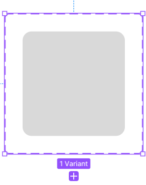
Below is a step-by-step guide that will teach you how to apply all these tools together in order to create a component set that is beginner-friendly, similar to the one showcased below:
Let’s get started!
Begin by Creating a Component.
Start by creating your desired element and once you’re ready, click in the header or.
Great, you’ve now created your component.
Rename your Component
Figma recognizes the parent component name as the text before ‘/’ and the variant name directly after the first ‘/’. Any subsequent text + ‘/’ will be used to name each conditional property.
Therefore, a component set with the name:
Checkbox/Primary/Large/Hovered/true,will have the following values:
Component set name: Button
Variant [Property 1]: Primary
Size [Property 2]: Large
State [Property 3]: Hovered
Checked [Property 4]: True
Create and Rename Variant
Creating robust and powerful component sets means creating variants that allow you to toggle between the component’s various appearances and behavioral states
3 most common variant changes:
Button color
Icon/symbol
Button Text
Override Preservation
To create a variant, go to create new property "+" and choose variant from the dropdown within the property side panel.
Step 3: The main component is now duplicated and this will be the first variant
Click into the component (Ctrl+click) and click the purple "+" icon right below it. You now a second variant and have begun your component set! Great Job!
Main Component: 4 Diamonds
Variant: 1 Diamond
You’ll notice there are different changeable aspect of a component called ‘properties’ that can be created. The meaning of each property will be explained throughout the article.
Once the variant is created, Figma automatically updates the properties panel to include property 1 and default.
Rename the property to match the specific type of property it represents, like "Button State" for a property that defines different states of a button.
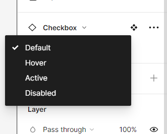
This tells me that my first variant is the default state of my checkbox component.
To add another variant, simply select the default variant within the component set and click on the purple "+" icon. This action will reveal the following interface for creating additional variants.
After creating the new variant, Figma automatically adjusts the name to "propertyname2" to indicate that it was created after the first variant. To make it more descriptive, you can customize the name from "Button State2" to reflect another state, such as "Hover" or "Disabled," depending on the specific functionality or visual appearance you want to represent.
Repeat this process until you’ve created all the desired variant states.
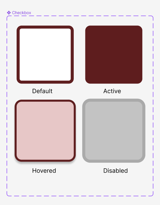
I’ve gone ahead and created the default, hovered, active and disabled variant states.
Naming variants: When double clicked on the left layer panel, the variant is labelled with property name=selected property
Using Components in a Design
Access the asset panel.
Expand the local components drop down.
Drag the desired component onto the canvas.
Customize the component's state by selecting it from the right-hand panel.
💡Please be aware that duplicating component sets will create a new set with the same name. While you cannot directly duplicate component sets, it can be helpful to use an existing set as a starting point for quickly adapting its properties and style to create a new set.
Awesome! I've gone ahead and given a fresh new look to the four button states based on our design preferences. Take a look and see how they perfectly fit our style!
Now that we understand variant naming, let's explore how we can utilize the Boolean and instance swap properties to position and customize an icon within the checkbox.
Understanding the Boolean and text property
The Boolean property in Figma allows you to use a TRUE/FALSE command to toggle between two possible modes of a property, like an on/off switch. It can be applied to an element with two states, and you can create multiple Boolean properties to control the visibility of different elements within your design.
Common Boolean Uses:
Active or inactive/disabled states
Show or hide icon
Show or Hide text
To show or hide an icon within a component:
Apply icon to default component
While Icon is clicked, click to create a Boolean property.
Create new property and rename appropriately
Beside the property name or state, click to edit property
Choose which state you will keep as default and rename to ‘true’.
Choose another state to which the toggle could apply and rename to ‘false’
After completing your edits, simply drag the component from the local assets panel. You'll notice that a toggle appears.
To Show or Hide text within a component:
Click ‘T’ and add text to default component
While text is clicked, click within the content section of the design panel to create a Boolean property.
Configure the initial or default copy of the component to match your desired specifications, and then click on "Create Property" to finalize.
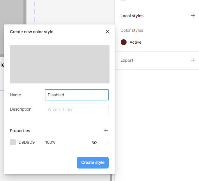
💡Create preset color styles for the various button or component states to
ensure brand style consistency and reduce decision fatigue.
To add a color to a style:
1. Naivgate to local colors on the right hand panel
2. Click + icon
3. Select color and choose style property name
4. Include few descriptive words on color use and when to apply (optional)
5. To save, click create style
Understanding Instance Swap Properties
The instance swap property allows you to easily switch between different instances of a component, allowing for efficient exploration and customization of various design options.
Its not just limited to swapping icons, but can be used with any component in Figma. You can swap instances of various design elements, including buttons, check boxes, cards, or even complex UI components, allowing for versatile customization and rapid iteration in your designs.
💡Instance swap in Figma is only compatible with pre-existing components. This means that all icons intended for use in instance swapping must already exist as local components within your file.
Select the component instance (a duplicate of the icon component) and place it in the appropriate spot in within the component set.
Select all icons within the set and click the ‘create Boolean property’ icon within the layer section on the right-hand design panel, locate the "Swap Instance" section.
Change the name accordingly to identify the property task, as ‘show icon’ and click create property to finalize
Now, you’ve created the ON/OFF toggle to view or hide the icon from the component.
To swap out different instances:
Click the dotted purple frame around the component set.
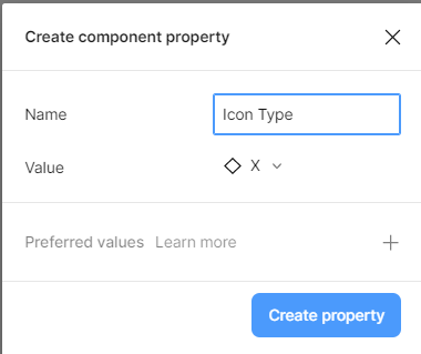
Click “+” to create new instance swap property that will facilitate the swapping of different icons
Name the component property accordingly and choose the preferred icon from the local icon folder. Once complete, click ‘create property
Select all icons within the component set using Ctrl+Shift.
Click ‘create instance swap property’ icon beside the icon name.
Attach the icons to the recently created swap property.
Now, you will be able to toggle ON/OFF show icon and the icon symbol.
In conclusion, mastering component variants, Boolean properties, and instance swapping in Figma can greatly enhance your design process by promoting consistency, efficiency, and dynamic customization. With these powerful tools at your disposal, you'll be able to create and manage components with ease, streamline your design workflow, and produce more visually appealing and interactive designs. Embrace the potential of Figma's component system to unlock new possibilities and elevate your design skills.
Thanks for reading UXploration’s Substack! Subscribe for free to stay up to date with design news, figma tips nad and support my work.